HEBDEN BRIDGE FESTIVAL
Brand Identity/ Collateral / Social Launch Campaign/


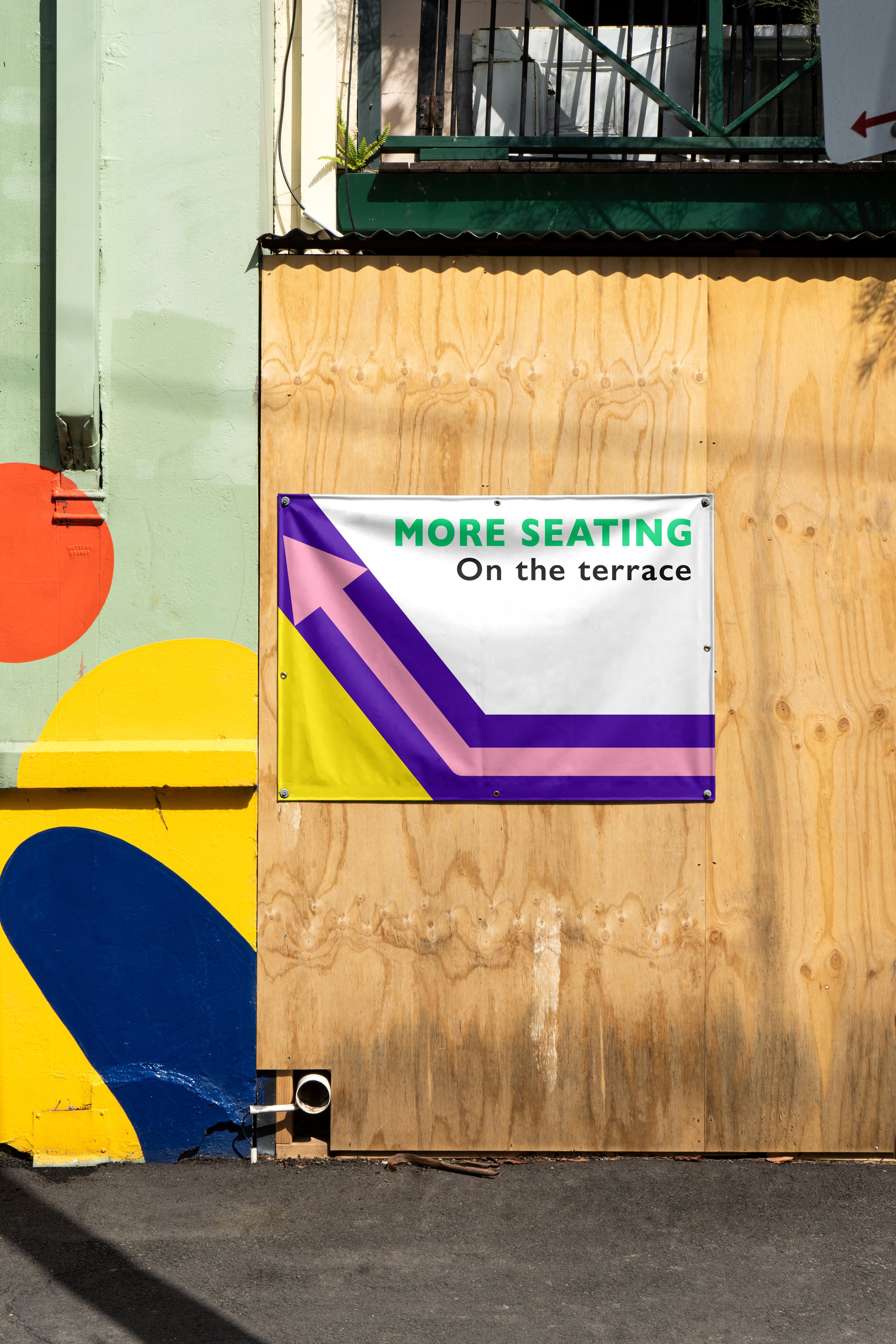
A bold and vibrant brand identity was created for Hebden Bridge Festival to reflect the town's creative energy and strong sense of community. The geometric shapes, inspired by building block shapes, are designed to be easily recognized by all ages and across cultures. These shapes can be moved and stacked in playful ways, adding a sense of interactivity and fun, while emphasising the idea of constructing connections and creativity.
Bright, uplifting colours were chosen to celebrate the diversity of the festival's attendees and to reflect the vibrancy of Hebden Bridge. The final designs captures the spirit of the festival, celebrating it as a dynamic and inclusive event where people and ideas come together.


